Apple has long been lauded for their design chops, making countless breakthroughs in user interface design to create some of the most iconic, user-friendly and user-empowering tech products out there.
In more recent times however, Apple has inexplicably dropped the ball by releasing products that don't live up to the impressive legacy they've built. Here are 5 products that make you question what Apple was thinking when they were released:
Magic Mouse 2
The original Magic Mouse originally released in 2009 was unlike any other mouse of its time, being one of the first to have a multi-touch surface allowing you to perform iPhone-like gestures on your Mac without moving your hand away from the mouse. It was a product that exemplified Apple at its best by genuinely improving the experience of using a mouse.
However, in 2015 Apple released the Magic Mouse 2 with one of the main features being an integrated rechargeable battery, which in theory improved the user experience by removing the need to regularly replace AA batteries. But in their infinite wisdom, they thought the best place to put the charging port (a Lightning connector like the one in your iPhone) on the bottom of the mouse, preventing you from using it while charging.
It was a very curious decision especially because countless other wireless rechargeable mice had charging ports in places where they could still easily be used while charging, and also because Apple made a name for themselves by feverishly avoiding having to make these kinds of design compromises.
Personally I've replaced my Magic Mouse with a Logitech MX Master 2S, a mouse that provides much better ergonomics and feels much more premium than the Magic Mouse and I've never looked back. You can pick one up on Amazon here.

Apple Pencil (1st Generation)
The 1st Generation Apple Pencil was also in principle a fantastic product, offering super-low latency and high-precision drawing good enough for graphic artists to start considering the iPad as a real productivity device.
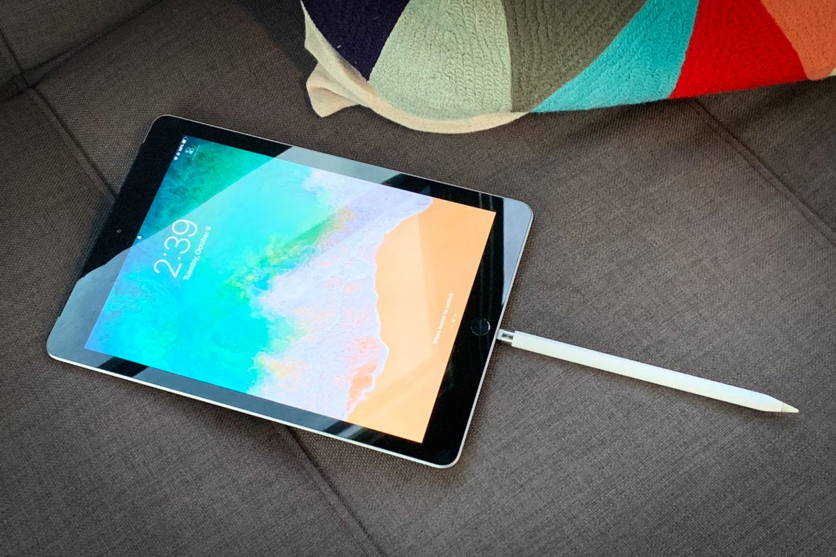
But to charge it you had to plug it into the bottom of your iPad, making it look like it had the most ridiculous antenna sticking out of it. Plus I would bet that there have been some tragic incidents of Pencils being snapped off by careless passers-by.
Thankfully, Apple learnt the error of their ways and the 2nd Generation Apple Pencil is able to charge by magnetically snapping to the side of the iPad, a much more elegant and sensible solution.

Siri Remote
The Siri Remote was (and still is) bundled with the 4th Generation Apple TV and up and while it had a well-received design allowing users to more intuitively interact with their Apple TV, the symmetrical placement of its physical buttons - while visually appealing - meant that if you picked up the remote without looking at it there was no tactile way to tell whether you had it right-side-up, leaving you to wonder why you couldn't swipe around the interface until you figured out that it was upside down.

Mac Pro (2nd Generation)
The 2nd Generation Mac Pro was quite a departure from the original Mac Pro, severely limiting the ability to upgrade and customise internal components that was a pinch to do in the 1st Generation Mac Pro. This was a major design misstep as the customers that used Mac Pros (typically creative professionals) heavily relied on being able to easily upgrade and customise internal components, and completely went against Steve Job's adage of "Design isn't only about how it looks, it's about how it works". Once again though, Apple recognised their failure and the new 3rd Generation Mac Pro is reminiscent of the 1st Generation, providing easy upgrades and customisation.
/cdn.vox-cdn.com/uploads/chorus_image/image/63276636/wireless_charging_airpower__gm6l29kbhdym_medium.0.jpg)
AirPower
Ah, the mythical AirPower. A universal wireless charger that promised to charge it all was announced to much fanfare alongside the iPhone X. The only problem was, well, it was never released. Apple never officially cited any detailed reasons for cancelling the product, but there were a number of reports that on a technical level it was way too ambitious, trying to cram in a grid of charging coils so that devices could be placed anywhere on the mat and charge without having to be placed in a specific spot by the user, a requirement of every other existing wireless charging mat. It was reported that having such a density of charging coils was very hard to keep from overheating, and with no technical solution to keep them cool the project was canned.
The vacuum it's created however was never destined to be left empty, as such many other manufacturers have given it a crack to varying degrees of success.
We receive a small commission from links in this blog post from Amazon.com.au.

